About Jazz on the Wall
The 31 paintings in this show were painted through my 50s—up to 2005. But I’d already been working toward painting them right through my 40s, so they really took me about 20 years to do. I first painted the two-level-stripe field—that’s the geometric composition form that structures the Jazz on the Wall paintings—back when I was 41, in 1988. I was deep in the studio equivalent of mid-life crisis and, it turned out, really needed to get back to color work.
Here's why I say back to color work. Before Jazz on the Wall, through my 30s, I had been intuitively composing overlapping, geometrically independent stripes (as you’ll see below)—not modular stripe fields like the Jazz on the Wall paintings. By the culminating series of that decade’s work all the stripes had a unique width, were uniquely paint-colored, and were at a unique angle to the frame.
Here are three of the eleven paintings I did in 1986, at 39—titled The Black Field Stripes—all acrylic on canvas, 30" square. (The stripes are tape-edged, and they don’t actually overlap.)

Action Painting (1986)
The Ecstasy of St. Theresa (1986)

Birds In Space (1986)
I had been pursuing a dynamic geometric distillation of the profoundly attractive viewing experience that Pollock and Kline had delivered through their intuitive allover composition of their spontaneous body-language markmaking/drawing (shapes).
And this distillation (as I pursued it by composing stripes freed from their usual modular organization) did open up the dynamic, intuitive, allover composition that the three paintings above feature–as well as deliver (in my view) the elegant mathematical coherence and beauty of their still geometric allover composition.
But this composition practice does not support the paint-color work that modular stripe-field composition is inherently dedicated to delivering, or, therefore, the emotionally satisfying viewing experience that modular stripe field composition famously features.
After painting the Black Field Stripes series in 1986, I didn't paint at all in 1987 and I was miserable. The Black Field Stripes had distilled my last decade’s painting into work that I was and am proud of. But even so, in getting there I'd lost my deeper connection to painting, and literally could not imagine how to go on.
By January of 1988, I was into the what else can I do stage of this discomfort—as in, OK, what's the absolute minimum painting I can do, that I will do, just to see? And this is what my inner painter wanted to look at.

Untitled
Two-Level-Stripe Field
30" x 30"
(1988)
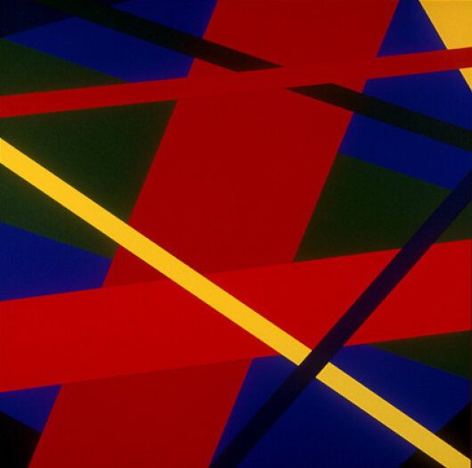
Speaking on behalf of my inner painter, I'll describe this painting as a field of (just three) two-level stripes. The backgrounds of the two-level stripes are contiguous. Each background stripe has a foreground stripe down its center. That's the geometric composition form of all the paintings in Jazz on the Wall.
Between that spontaneous one-day painting and starting the Jazz on the Wall work a decade later, I routinely discarded both composition studies and finished paintings while getting my paint-color work up to comfortably playing this simple form every day at the paint table. I mostly stopped painting finished paintings at all during the early work, rather than keep discarding them while I was still being routinely disappointed after repeated viewing. Painting, waiting to see, and then discarding is frustrating.


By a composition study–which I called a “palette”—I mean a 12" high x 40" wide piece of canvas, brush-primed with the standard white art-painting primer called gesso. (Unusually, I primed the canvas on both sides, so it would be quite stiff, stay flat on the paint table, and be easy to hang up with masking tape to look at.)
The composition study area outlined on each palette, like all the paintings in the show, was 30" wide. On one side of each 12" x 40" white palette, I completely pencil-and-ruler outlined-in a 10" high x 30" wide cross-section of a full-width stripes composition. The outlined stripes could then be masking-taped off, paint-colored with a palette knife, and dried in seconds with a hair dryer.
The palette stripes could easily be overpainted several times, to revise the gradually appearing composition. The constant prep-work of mixing more preliminary colors, and just knife-sampling them together, was done to the side, on other, unruled primed canvas. I worked with compositions of from three to nine background stripes. The Jazz on the Wall paintings start with nine stripes in the first series, then settle on seven, as in the three paintings above.
(By the way, pigments are the finely-powdered-solid material in the paint’s binder that are the source of the paint’s color. Acrylic-binder artist’s paints contain the same technologically contemporary pigments as oil-binder paints, but are water based. Hence the quick drying time of acrylics. But the masking tape I used, with its very clean, square edges and smooth, even adhesive, is made for industrial purposes, and a special order. I never asked Scotch Brand why the aerospace industry would need masking tape at all, but the temperature specs on this tape are apparently important to the engineers who make my use of it possible, and I’m grateful to them from the bottom of my art.)
The easy-to-make palettes made the paint-color work easy, as studio practice. Just select, mix, and then sample my paint-colors, as they would touch or otherwise be together among the (usually) six to nine total colors in the painting. It would take (say) a month of watching that palette composition develop for me to get (I hoped) what these particular paint-colors were doing for and to each other, help them finish together, and decide whether this would get painted.
A Few Words About Stripe Paintings
In the 1950s and '60s, arrays or “fields” of stripes suddenly appeared in the work of many leading abstract painters, presenting very different appearances depending on the painter's highly individual paint-handling, their stripe drawing (shapes), and especially on their paint-color work. Stripes were painted in full-bodied paint and stained; tape-edged, brush-edged, and poured; drawn vertically, horizontally, and diagonally, wide and narrow, straight and as waves.
What the stripe field offered all those painters was a coherent, repeatable, highly individually adaptable general structure for composing geometric shapes that were similar or identical except for their paint-color, and therefore featured the painting's color composition. Those painters made their color work, in effect, an independent subject in their paintings.
I was delighted to see the radically new abstract color-work and fully abstract 20th century beauty that those painters were bringing into the 700-year-old European-American painting tradition. My two-level-stripes composition form is a direct development of their pioneering geometric compositions.
I’m sure I first imagined the simple two-level-stripes form in 1988 for the same reason that those pioneering abstract painters turned to modular stripes—as the anxious and regimented post-war period became the 1960s. Those painters certainly felt the joyous mass hope for increasing social fairness and individual freedom of that decade’s optimistic beginning. And color work can really help share joy and hope through painting.
And for me in 1988 at 41, getting back to sharing feelings like those through color work was absolutely the prospect and challenge that could finally move me back into the studio. Hence my inner painter’s “Here, do this.” painting.
A Few Words About Abstract Color Work
The color work in this show is literally grounded on the color work of those 1960s stripe painters—“figure-grounded”.
In the post-war through ‘60s period, three of the most basic color interactions in abstract color work were often called “edge interactions”, “figure-ground interactions”, and “color shifts”.
In the background level of the two-level stripes form, the stripes of paint-color are contiguous, so they produce edge interactions. They affect each other’s appearance along and across their shared edge.
In the foreground level, the foreground stripes do not touch each other, and are surrounded by their own background stripe, so they produce a figure-ground interaction. A figure-ground interaction can make the figure paint-color appear very different to our perception than it appears on a different background color, and this difference in appearance is called a color shift.
Color shifts can even be dramatic enough to make one opaque figure paint-color, seen over two different ground colors, look like two distinctly different figure colors—so apparently different that we have to be independently convinced that they're not.
Obviously, what my inner painter wanted was to get back to basic abstract paint-color work at the paint table, selecting, mixing, and composing colors, sometimes all day. So the field of two-level stripes, as a composition form, effectively dedicated my painting to featuring that color work—with edge interactions, figure-ground interactions, and color shifts. I just needed to re-appreciate the chance for direct emotional connection—as well as the sheer optical pleasure—that abstract paint-color work offers.
Hope you enjoy the show.